Rebranding assignment
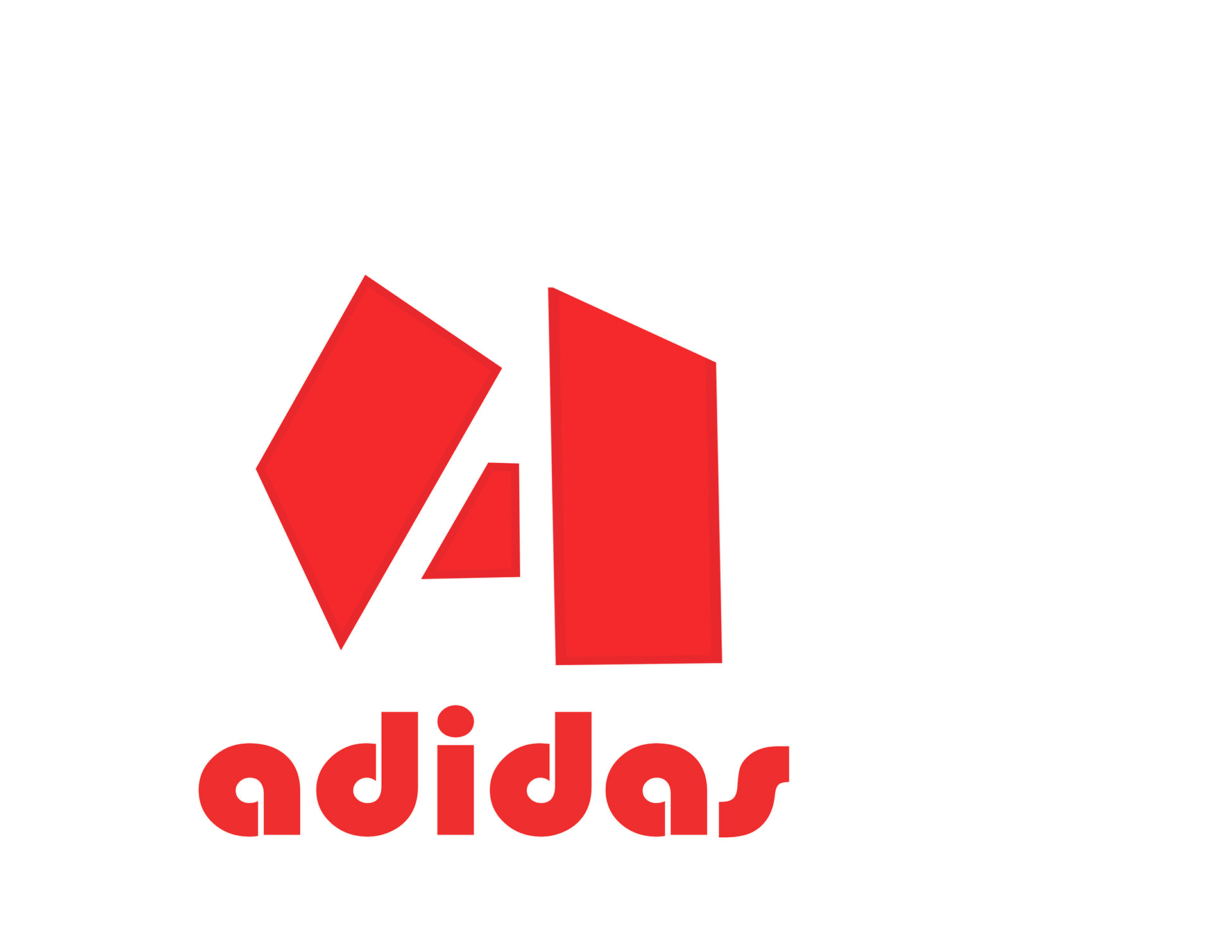
For my project I chose the sports brand Adidas to rebrand. First I started out by doing a layout of the Adidas logo, First I changed the colour of the logo to red because it worked really well with adidas, and the sports theme as well, then I changed the typeface first to Bauhaus 93 because I thought that it looked like a typeface that would work with Adidas and it looked sporty, then I used rectangles to skew and free transform on to the original Adidas logo so i can get the bars of the logo to create my design of the logo.
Process Work
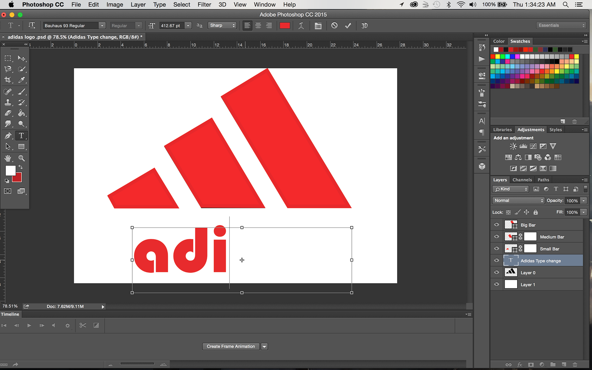


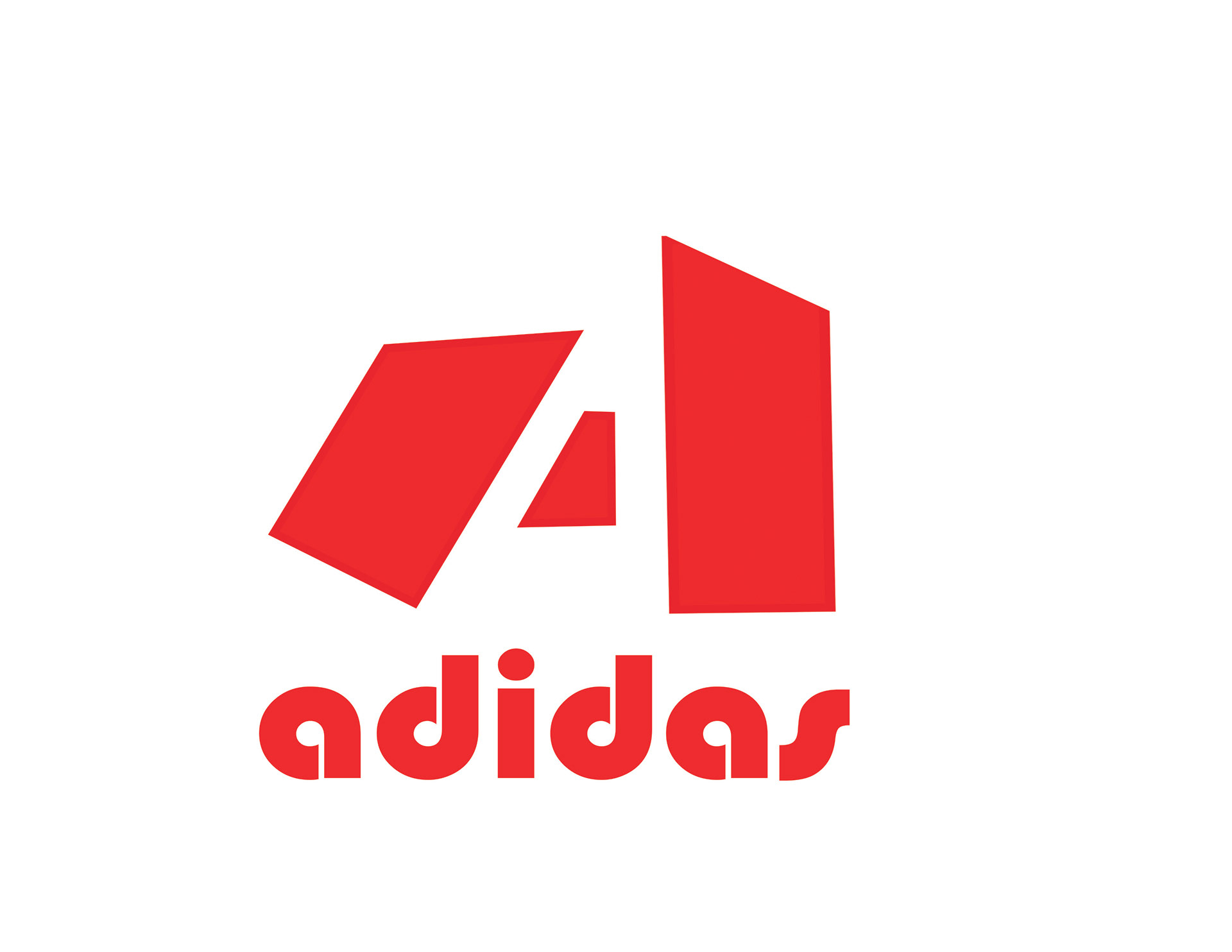
Then I tried out and designed a few logos for Adidas, just playing around with the bars and repositioning them free transforming them, playing around by making them horizontal and vertical and came up with a few designs, that seemed good but not what I wanted the final design to be.
Logo Concepts


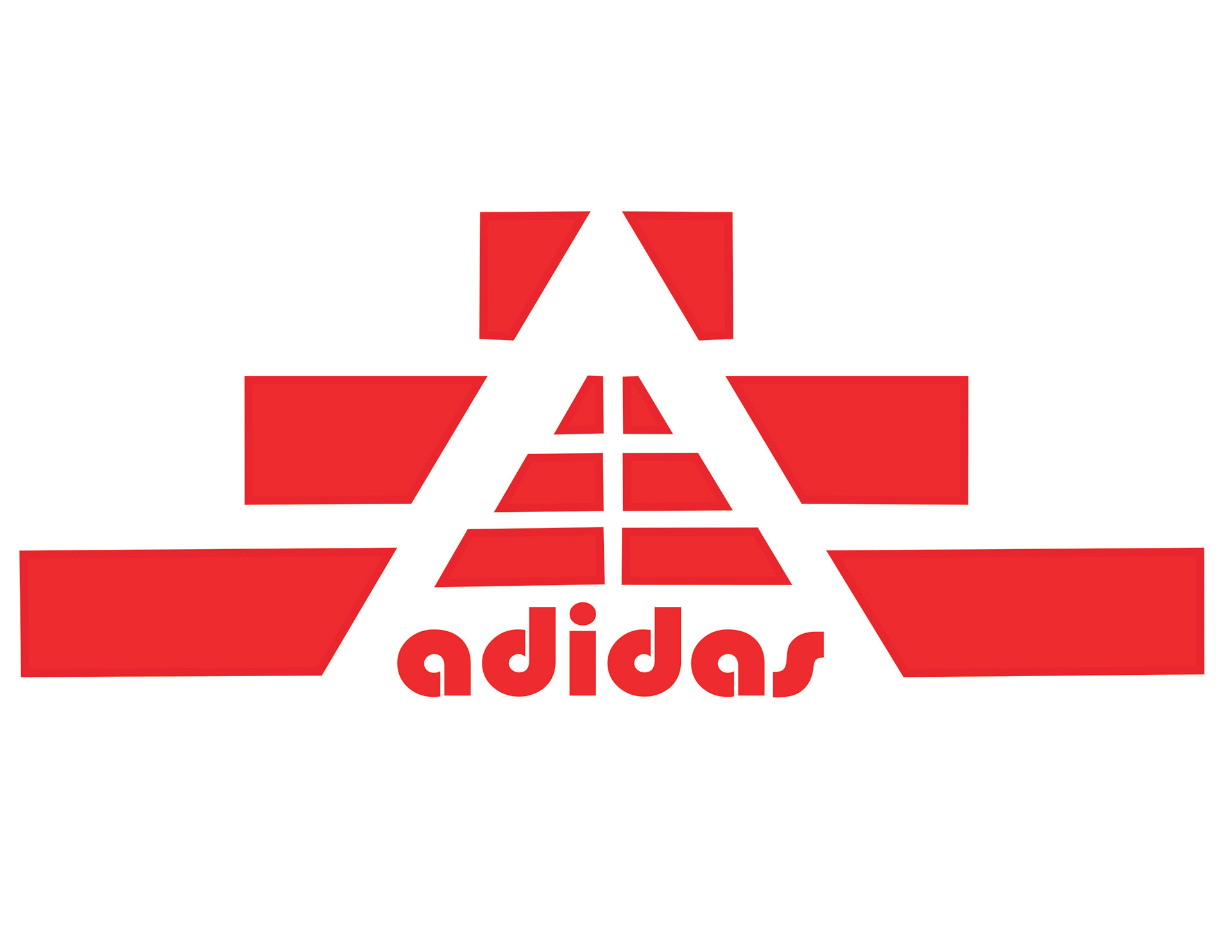
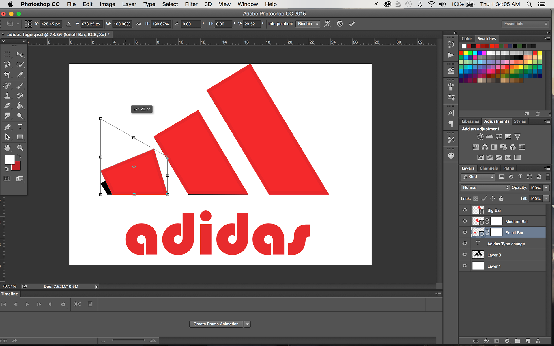
Then I designed one which I really liked and thought that it worked well for the brand.
Final Logo
This logo that I designed, I found that it worked really well for adidas since it creates a nice big A, and the bars look like stairs you have to climb to reach the top where your goal lies, and I chose to use that as my final, to make this design I rotated the bars 90 degrees and then I flipped the bars horizontal, so the points would face each other, and then I positioned them in away that they would make a triangle, and then for the middle I took the two top bars flip them vertical and then used the horizontal option to make them them side by side and then positioned it in the center of the triangle so it makes a big A, and also make it look like the stairs to climb to the top to reach your goal, and put the logo’s typeface right under the middle triangle.
For my two products I chose shoes, and a t-shirt, so first I took a picture of both the shoe and the t-shirt
Products
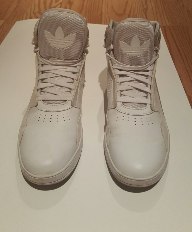
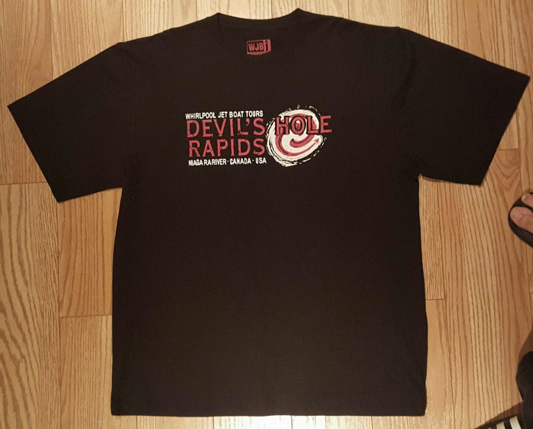
Then I edited them in photoshop to make them look better and to make them look like they would work with my logo design, i adjusted the brightness and contrast, the levels of lighting, exposure, and curves to make the images look better, and also use the quick select tool to cut the images out and put them in a new file, i also used the patch tool and spot healing tool to get rid of the previous designs on the two products.
Process Work


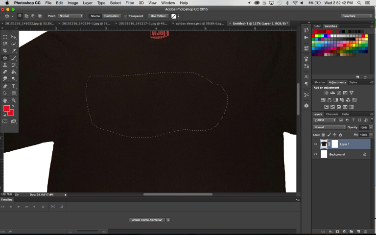

And then i put my logo on to the designs, to make the logo look realistic and like rubber on the shoes I added and changed the settings of the bevel and emboss, and the drop shadow, and changed the brightness and contrast, levels, and exposure to make it fit in colour wise, and then i used warp , and perspective to adjust and fit them on to the shoe and free transformed the size. For the t-shirt i had to adjust the brightness and contrast, levels, exposure, and also used warp and perspective to fit on to the t-shirt, then I added noise on the logo to make a grainy texture that would work just right for the t-shirt, and then lowered the opacity of the logo to make it blend in.
Final Products with logo


Then I went on to make the GIF for the logo, for this my design starts off as a closed box , and then the bars slide out to make the logo, i had a lot of fun doing the GIF for the logo.
Final Logo GIF
